This video is another in a series featuring Annie Leonard, who previously presented us with The Story of Stuff and the Story of Bottled Water. In The Story of Cap & Trade Annie introduces us to the concept of cap & trade in our current state of industry. It is quite frightening to know that our planets well being is being wilingly sacrificed by several few with power in order to profit from economic gain. Though her point about "paying back our ecological debt" would do its fair share in striking fear into those who are still oblivious to the fact of our declining environment.
All is not doom and gloom however. Several companies are now getting on the bandwagon of ensuring their actions as an enterprise do as little harm as possible to our environment. This would only bode well for a future where our resources currently look pretty bleak. The consumption of these raw materials are now at an alarming rate. Changes done now are imperative to the sustainability and future of our planet.
Wednesday, June 16, 2010

Design For Life
The series featuring Philipe Starck does give us IDES students a real insight to the inner workings of the design world we ourselves are vying to get into. Though Starck himself might be portrayed as an egotistical prick, the knowledge base and experience he has does show through when dealing with the projects the various participants undertake. Anyone can have ideas, but to have ideas good enough to have clients pay for them, and design as a job does require a very high level of commitment, enthusiasm and hard work as the participants on the show general tend to illustrate.
Another great point that Starck tries to plant into these young designers, is also to look at their own designs, and question whether or not it could be turned into a necessity. Starck challenges them to design for a purpose, rather than to come up with something, only because they have to. This really does put what we have done so far in studios into perspective. Enabling us to be more consistent in our future designs as we learn from our tutors and experiences that we encounter in life.
Another great point that Starck tries to plant into these young designers, is also to look at their own designs, and question whether or not it could be turned into a necessity. Starck challenges them to design for a purpose, rather than to come up with something, only because they have to. This really does put what we have done so far in studios into perspective. Enabling us to be more consistent in our future designs as we learn from our tutors and experiences that we encounter in life.
Tuesday, May 4, 2010


Friday, April 2, 2010
11th Hour Reflection
Having Leonardo Di Caprio shove facts about corporations and the destruction of our planet is not how I wanted to start off my day. But the sad and shocking truth is, we are killing our planet. We are using more than we should. Its hard not to sound like a broken record trying to say how our planet is at the brink of destruction. Having this reinforced by the fact that global corporations are the ones with the most power to do anything right now really doesn't put my mind to ease at all.
"Corporations are the weapons of mass destruction". Such a short phrase, but one that really makes you think of how different our world would have been if the right people who hold so much power in these corporations had decided to make certain decisions so much more differently. If they were not motivated by greed or the need to have to make a profit from most things they do, if only they knew what they were doing to our planet, our resources, if only they actually gave a damn, the changes they would have been able to influence and implement, would have meant a cleaner, greener planet, a healthier planet for all of us. This next quote from the movie, "We live in a corporate world which makes authority", demonstrates how we are all at the mercy of these corporations. With the amount of power they hold over us, over our government, it is very worrying how easily they could influence the decisions by the government, or how they are able to rid of any problems or anyone who gets in their way.
“Our attitude is based on selfishness, economics, and politics”. This particular phrase really does sum up the nature of how we as humans operate in the world right now. We are taught at a very young age that to succeed in this world, it isn't by how great you are as a human being, but rather how great your earning powers are compared to your peers. We are bought up to value money and currency more than we value other fellow human beings. It sounds bleak, but for all that we are working for at the moment, it IS to get a job, it IS so we can earn enough for a comfortable living, it IS so we can make money.
But of course it is great to know that for all the damage that not only these corporations, but we ourselves are doing to our world, there are those that have realized the flaws in the ways that we are currently living, and it is very encouraging that more of us in this world are starting to realise this too. Though we have a very long way to go to even try and repair our world to what it used to be, it is still worth trying for if not for our own good, but the good of our future generations.
Tuesday, March 30, 2010
Charette 2
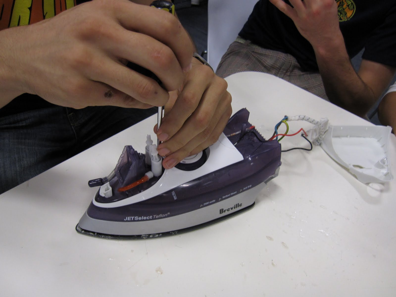
For our second charette activity, we were required to disassemble a home appliance and identify materials used during manufacture as well as collaborating with the Greenfly organisation website to identify shipping and material costs of the product. Our group was given a Breville JETSelect Teflon iron.

From our diassembly exercise, we found that household appliances such as these were in fact made for non-dissassembly. Many of the parts had to be forced apart in order to identify the various components as well as materials used.


The final bit of this charette required our group to redesign the particular household appliance given to us. We ha to fulfill several criterias which included the reduction of materials used to manufacture the particular product and a streamlining of the original design.


From our diassembly exercise, we found that household appliances such as these were in fact made for non-dissassembly. Many of the parts had to be forced apart in order to identify the various components as well as materials used.


The final bit of this charette required our group to redesign the particular household appliance given to us. We ha to fulfill several criterias which included the reduction of materials used to manufacture the particular product and a streamlining of the original design.


Thursday, March 25, 2010
Charrete 1
For our first charrete session we were divided into groups and were tasked with finding solutions for an IKEA chair that were given to us. Here is a breakdown of solutions to those tasks.
The Ivar Chair given to our group.

Our first task was a mind mapping session to various problems of the particular chair.


The following are several design solutions to problems related to the user.
1. Prolonged use of product

Several options of modification to the chair. These included interchangeable backing, steel-made replacements for the legs as well as interchangeable shapes for the seats.

Stack-able/modular solution to the chair which provides easier storage if users purchased several of the Ivar chairs.
 This solution focused on being able to fit a bag attachment. This can be used for extra storage space or be turned into a bin for rubbish.
2. Physiological Pleasure after market parts

Various design considerations for physiological pleasure of users. Tarp finish and contoured finish seating modifications. Solid curved backing for comfort.
 Tarp attachment to replace wooden seat. Hooks on its side are to clip to the seating frame of the chair.
3. Psychological/sociological after market attachments/products.
 Cushion padded sleeve to be placed over the back support of the chair.
 Height adjusting extension. To provide option to adjust height of seat. Top face fits underneath the chair.
 Leg extender for chairs. With height provided, chair can now be used as a bar stool.
A final modified design of the chair was then decided upon, and the following is the subsequent final design as well as a hero shot.


Storyboards we're also produced to illustrate the chair during the purchase process as well as its new modifications and new uses.


Thoughts on Final Design
For our final design, we decided for further physiological pleasure, we were to include our idea of a more comfortable backing as well as an improved curved finish to the original seat. Added to this was also the extra foot rest placed at the front bit of the chair frame. Wedges were also added to the front legs to have the chair rest at a more comfortable angle for the user. A further modification made to the chair was also the option to now be able to have extra storage space underneath the seat, similar to the storage space found in piano chairs.
Reflection
For this first charette exercise that we did, I found that our design capabilities were really tested with the format of quick and short periods given to come up with various solutions for the various design problems we had found. Coming up with a final solution at the end also allowed us to work together as a team, agreeing as well as disagreeing on design decisions. This would probably replicate a similar scenario in our future as designers, learning to be able to work with others to come up with a design solution. Overall, this charette was definitely helpful in exchanging ideas as well as working on our own in improving our pace and quality of our design.
Tuesday, March 16, 2010
"Every object tells a story, if you know how to read it" -Henry Ford
Objectified really opened my eyes to now view industrial design in a COMPLETELY new perspective. It reignited my passion in some ways showing me that there is so much more to design than just a uni course that I'm taking.
Andrew Blauvelt summarizes the phases of modern design in 3 steps. The first and most influential form of design is to design through form. A designers job in its essence is to give o product its form. To give it a reason for the product to look how it is meant to look. It might seem as an easy concept, but it actually requires a designer to think about the form of the design very thoroughly as every curve, every edge, every line gives a different meaning to the product.
Andrew continues on his thoughts of modern design by stating another phase of modern design being the symbolism which derives from a particular design. This means that the design of the product takes into consideration of things such as the cultural context the design might symbolize. This notion of symbolism then leads into the last phase of design that Andrew talks about, being the contextual aspects of design. An example would be to take the human-object relationship of a design into consideration.
Dieter Rams, a former design director for Braun lists what he thinks design should be during his segment in the video. Some of the most notable ones to me include his thoughts that good design is aesthetic design, is consistent in every detail, should be innovative and lastly, good design should be as little design as possible. Dieter really does a great job by summarizing what he thinks good design is and should be. It provides sort of a guideline that can be applied to our own process of design. He's calm and systematic approach to design really pushed me into wanting to implement this sort of mentality into my design process. After all, one isn't hired to be design director for one of the foremost design directed companies for doing a half-arsed job!
Another phrase That Rob Walker, a columnist and writer on design used in the video, was stating that designers strive in making products 0r designs that look 'now', look like products designed 'then', in order to have them purchase the 'new now' designs. I see this as a very bold and truthful statement in our current culture. People will always have a want for new things even though they own products that still perform tasks that they require. Humans have a need to follow current trends and purchase or replace their older products just because the products in which they own, are now viewed to be 'old'. But ironically enough, the video is summed up by Rob when he says that 'you keep products that tell the story of you'. How interesting that our culture has brought us up to constantly replace products we buy, but still, we as consumers, insist on keeping our old products for the memories that they can give us.
Saturday, March 13, 2010

Friday, October 24, 2008
Project 3 Rationale

For this project, I looked to capture the event or moement in sport, in my case soccer, where one team scores at the very last moment in most cases either to win a match, or at other times to win a cup/trophy/etc. The project is basically a diary of sorts, something that can be built upon and used again and again. The idea of it is for every memorable goal scored for a win lets say, the user would put a golden peg on the miniature pitch to represent the goal scored from whicever position of the pitch.
 Technical drawing of the product.
 Final shot of the product.
Task 4: Bad Design
In this day and edge, you would expect bare minimum requirements when u enter an elevator. Floor number buttons, floor indicator and obviously an open and close button for it. But turns out the closest elevator to me wouldn't even have these bare essentials! My apartment elevator has proved troublesome at times, constantly shutting when there are people still tryin to get in and out of it. It also proves inconvenient when there is someone just behind you trying to get in, and you try your best to hold the door open, and the it shuts in the guys face. Doesnt't leave a good feeling with me since it'll probably send out the wrong me ssage.
 ssage.
My solution for this particular bad design is simple, add open and close buttons to it! Anywhere would do really. down the bottom, up the top anywhere. For me i think it is very important to have these buttons as common sense. To hold open or to close the door of an elevator at will. Below is a simple sketch of what should have been on this elevator.

Task 5.5: Video Reflection 5
The video shows the daily life of a designer and shows the steps of making a finalized product, such as recieving the brief, through to the brainstorming, and the crucial steps to getting the product such as the scooter and the Phantom Bike manufactured to the stage which the client wanted.
From there the product starts to take shape and working with groups are an important as feedback as to how it can be improved and interaction with others can take your product in a good direction. One of the things ive learnt is to constantly keep in contact with clients as they are the major point in the process, trying to satisfy their wants and needs. Having a number of different concepts are good as there are other things you can fall back on if your first concept doesnt go as well as planned.
From there the product starts to take shape and working with groups are an important as feedback as to how it can be improved and interaction with others can take your product in a good direction. One of the things ive learnt is to constantly keep in contact with clients as they are the major point in the process, trying to satisfy their wants and needs. Having a number of different concepts are good as there are other things you can fall back on if your first concept doesnt go as well as planned.
Saturday, September 27, 2008
Assignment 2 Rationale

The Flat-Me Boxes are seen as a gift set to be sent to family and friends. Used basically to store items of value or just in daily use. The boxes are able to be flattened when needed to be stored away. The use of primary colours help to keep the overall visual appeal. The mixing and matching of different coloured parts of the boxes simply support the fact that the boxes are intended to be sent in a set.
The overall sizes were made to fit the C4 envelope which the objects were to be sent in. With the length of a C4 envelope being 324mm, the boxes had side lengths of 100mm each. This would give the boxes a bit of lee-way when the studs were put in to connect the various parts of the boxes.
Thursday, September 18, 2008
Task 5.5: VIdeo Reflection 5
ANNIE LEONARD
The biggest message that I got from this video was probably the unavoidable fact that consumption is now our way of life. With the amount of waste produced just to make products that we constantly buy and replace, it does not bode well for our planet. The whole material economy cycle that Annie has showed does its best in making us consumers realize the vicious cycle that we are a part of and continuing to support. Annie further explains how the media is also used to aggresively fuel this addiction of ours to constantly buy newer products. After thinkin about this point, it does become frightening how much advertising we really are exposed to everyday as well as ideals that are put into our heads in order to follow the norm set by them. To sum it all up, sustainable design to me is probably the best way to go about this growing problem. This as well as recycling should slow down the need for us to constantly replace products that we own.
The biggest message that I got from this video was probably the unavoidable fact that consumption is now our way of life. With the amount of waste produced just to make products that we constantly buy and replace, it does not bode well for our planet. The whole material economy cycle that Annie has showed does its best in making us consumers realize the vicious cycle that we are a part of and continuing to support. Annie further explains how the media is also used to aggresively fuel this addiction of ours to constantly buy newer products. After thinkin about this point, it does become frightening how much advertising we really are exposed to everyday as well as ideals that are put into our heads in order to follow the norm set by them. To sum it all up, sustainable design to me is probably the best way to go about this growing problem. This as well as recycling should slow down the need for us to constantly replace products that we own.
Sunday, September 7, 2008
Assignment 1 Rationale
BLADE BLADE


The Blade Blade is a merging of 2 already known concepts int he world of cutting blades. For those who have experienced the need to swap and change between a regular sized cutting blade to a much larger option, The Blade Blade easily provides this option. Targetted for users between the ages of 16 all the way through to people in their late 40's, with an interest in arts or just require the use of cutting blades in their daily lives. The Blade Blade provides a much more modern alternative to the cutting blade range.
The main attraction of The Blade Blade is obviously its ability to provide the option of a large and small cutting blade width. The smaller cutting balde can be used while placed in the dock of the larger cutter, or pulled out to be used by itself. The Blade Blade also has rubbery grips positioned in areas where users place most pressure with their hands and fingers. This is to provide the user with much comfort while using the cutting blades.
The Blade Blade also aims to educate users to break off the ends of the blades in a much safer manner. This is done by the introduction of symbols painted into the end cover as well as the underside of the front edge for both the mini cutter as well as the larger one. It uses mirrorable symbols and or images such as a heart shape or a yin and yang symbol. When brought together to form the shape, the user then knows that the position in which the covers are held is correct, and they then can proceed to break the blade forwards, in the case of the heart, breakin a heart as it were.
Monday, August 25, 2008

Sunday, August 24, 2008


Thursday, August 21, 2008
Task 5.3: Video Reflection 3
YVES BEHAR
Yves Behar discusses the concept of designing more than just for the sake of design. He states that to produce a good design, the product should continue to enthuse the user long after it has been in possession. This has made me think more about the importance to have our design connect to the user at a much deeper level. Best example being his 'one laptop per child' concept. Having such technology being shared with children all over the world aiding them in their education and at the same time allowing them to have individual experiences and a connection with their own laptop. Yves puts out the notion that a working design should bring more importance, more value even to the users themselves. Yves' way of convening this idea has made me realise this important point in the design process, making it an integral part of producing a good quality design.

Yves Behar discusses the concept of designing more than just for the sake of design. He states that to produce a good design, the product should continue to enthuse the user long after it has been in possession. This has made me think more about the importance to have our design connect to the user at a much deeper level. Best example being his 'one laptop per child' concept. Having such technology being shared with children all over the world aiding them in their education and at the same time allowing them to have individual experiences and a connection with their own laptop. Yves puts out the notion that a working design should bring more importance, more value even to the users themselves. Yves' way of convening this idea has made me realise this important point in the design process, making it an integral part of producing a good quality design.
Thursday, August 14, 2008
Task 5.2: Video Reflection 2
ROSS LOVEGROVE


In this video Ross Lovegrove talks about his passion involving organic and intelligent form in his designs. The one thing that I’ve taken from this video is that instinct plays a crucial part in the work of designer. Seeing that there is no experience that can be taken into consideration when comin up with a new concept, instinct is what good designers depend on to make their best decisions.
Thursday, August 7, 2008
Task 5.1: Video Reflection 1
DAVID KELLEY


The video does introduce some interesting ideas that are put forward to us. They show how designers are constantly thinking outside of the norm and coming up with ideas to really make people stop and think about the current state of design. I have probably taken most notice about his incorporation of human behaviour and its relation to design.
The Prada dressing room incorporates impressive technology that is now available, one being the liquid crystal door for their changing room. The dressing room also utilizes common technology such as video playback in their ‘magic mirror’. The customization of cubicles concept was pretty interesting. One would think that this kind of concept might already be put out there into use, but at the moment, obviously not. Having the spyfish on show, did make the whole video a bit jumpy, seeming more of a quick display of his ideas, though this might be his aim.
The video has probably made me think more about industrial design as a whole, not just focusing on one aspect of industrial design eg. Product design. It has made me take the much broader elements of industrial design into consideration.
Task 2: Good Design
Firefly flyPhone


Designer: Firefly
Manufacturer: Firefly
The Firefly flyPhone is a relatively new mobile phone made by the company Firefly mobile, which is a carrier that makes a lot of kid friendly phones which is predominantly targeted for a young audience, around the ages of 10 to 12. The previous versions of the flyPhone were very basic, such as not having keypads or a colour screen. This phone is ideal for parents who want to have a certain amount of control over their children’s mobile use, such as calls and texting. However, it does offer the users plenty of features that they would find in more upscale phones.

Overall the design doesn’t look very sturdy, probably wouldn’t be able to handle a lot of knocks. But it does fit into the users hand very well. The buttons and keypad might be slightly small, perfect for children. It incorporates a pretty smart keypad design where, instead of only serving as a number pad, it can also be turned into a navigation pad.
DESIGN ANALYSIS:
Line: Straight and smooth.
Balance: Symmetrical on both sides, as well as top and bottom.
Contrast: Contrast between the colour black and blue gives it a solid feel
Form: Simple block shape with curved edges. Soap bar type body. Fits into users hand easily.
Colour: Use of the primary colour blue for most of the body as well the backlighting for the keypad. Black is used for its front and remaining keypad areas.
Texture: A very plastic feel to it.
Proportion: The transparent see thru plastic cover makes up most of the outer body.
More information of the flyPhone:
http://www.fireflymobile.com/flyphone/
http://www.retrevo.com/s/Firefly+flyPhone?rt=sp
http://www.phonescoop.com/news/item.php?n=2340
http://business2-cnet.com.com/cell-phones/firefly-flyphone-blue/4505-6454_7-32735405.html
Subscribe to:
Posts (Atom)